
Background
Converse Animal Shelter, Inc. is a nonprofit, no-kill animal shelter operating in Converse, Texas. They are committed to helping as many animals as possible find their forever homes, and like any other nonprofit, rely on the generosity of others to help keep their doors open. This shelter needed some rebranding to showcase their personality and professionalism.
Choosing Your Next Furry Family Member
Animal lovers everywhere can surely understand how heartbreaking it can be when animals have to be euthanized. At CASI, households of all shapes and sizes are welcome to select their next cat or dog to take home. However, for those new to the adoption process, this can be a bit tricky. And even for those who are familiar, there are so many animals to choose from and so many factors to consider that picking just one or two animals from the mix seems like a Herculean task.
Objectives
Establish the client’s brand identity by creating design guidelines.
Edit the site content to follow tech comm/design best practices.
Test prototypes incorporating brand identity and edited content.
Use feedback from user testing to improve the site’s UX.
Examining the Original UI/UX
Original UI
On the UI design end of things, the site had some areas where the design could have been more accessible.
- The site included several instances where the color contrast ratio needed improvement, with the most notable area being the contrast between the navigation bar and the selected/hover state for the navigation items.
- The Home page also included some links that did not contrast well with the images underneath them.
The Resources page used underlining to establish the headers’ hierarchy rather than reserving that for links, and all text was the same color, making it difficult for users to tell which resources had links and which did not. In addition, the font was smallcaps, reducing the page’s readability.

Original UX
On the user experience end, the site’s layout made some unconventional choices when compared to similar websites.
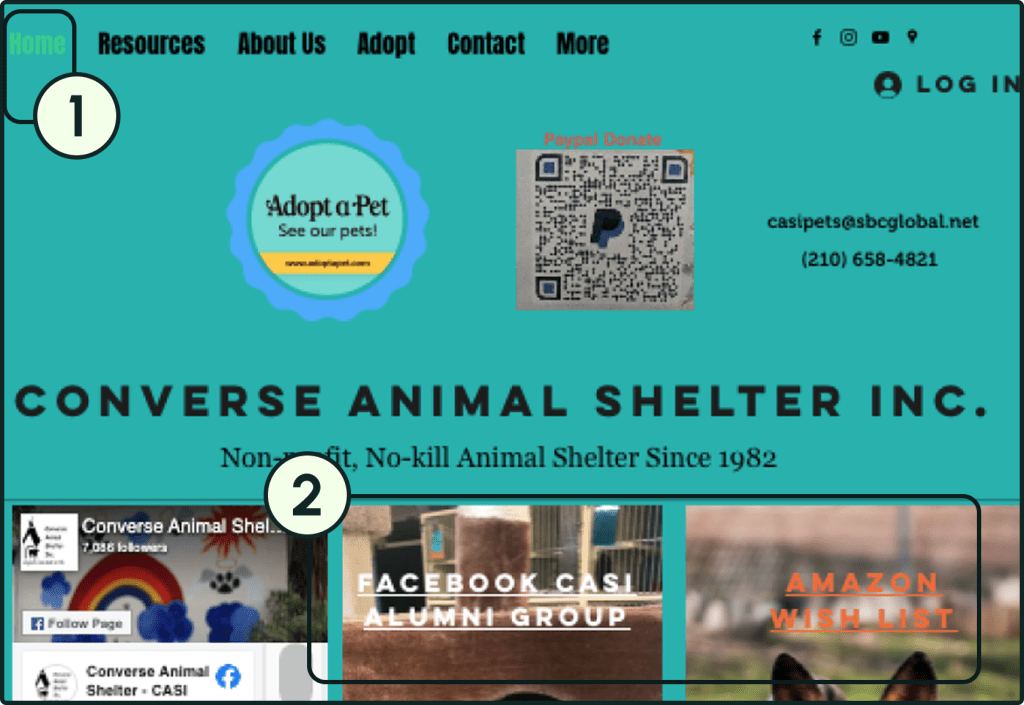
The AdoptAPet link in the navigation bar, along with being less conventional, navigates users to a different website, undercutting the main “conversion” for the shelter- to get animals under their care adopted.
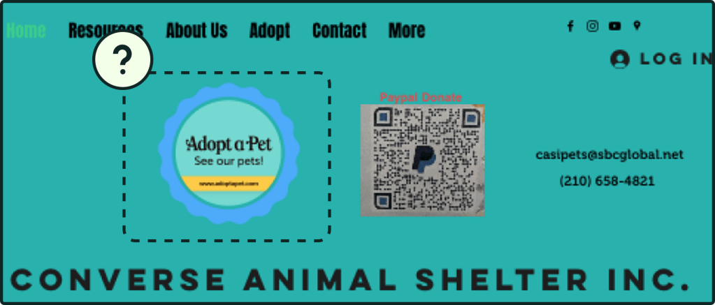
In addition, the pet pages lacked exhaustive information on each pet, ranging from the basics such as estimated breed and age, to pertinent information such as health history and whether the animal can be housed with children or other animals. Without knowing these details, a user would be less confident in selecting an animal, and may even opt for another shelter that makes sure to list all of these things.
The adoption fees were placed on the Adopt page, rather than in close proximity to the animal information. Since the fees are based on age, failing to name the age for each animal only made users confused as to how much each animal costs.
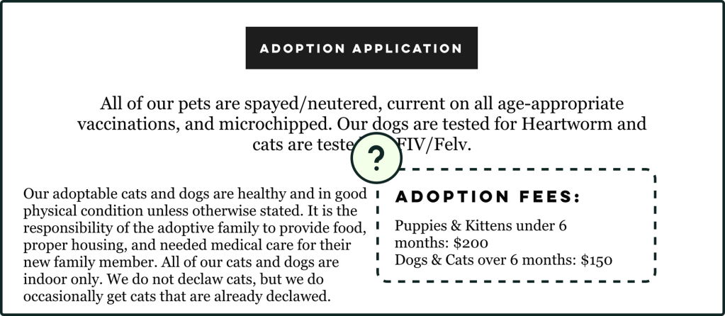
The Adopt page also failed to explain the details of the adoption process, such as interviews with prospective adopters or how long it takes for an application to be processed. Users need this kind of information to be readily available, as the process is not the same at every shelter. Despite being important information to contribute to “conversions”, the process was not mentioned anywhere on the website.
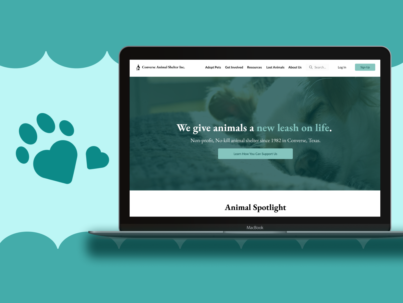
Building the Brand Identity
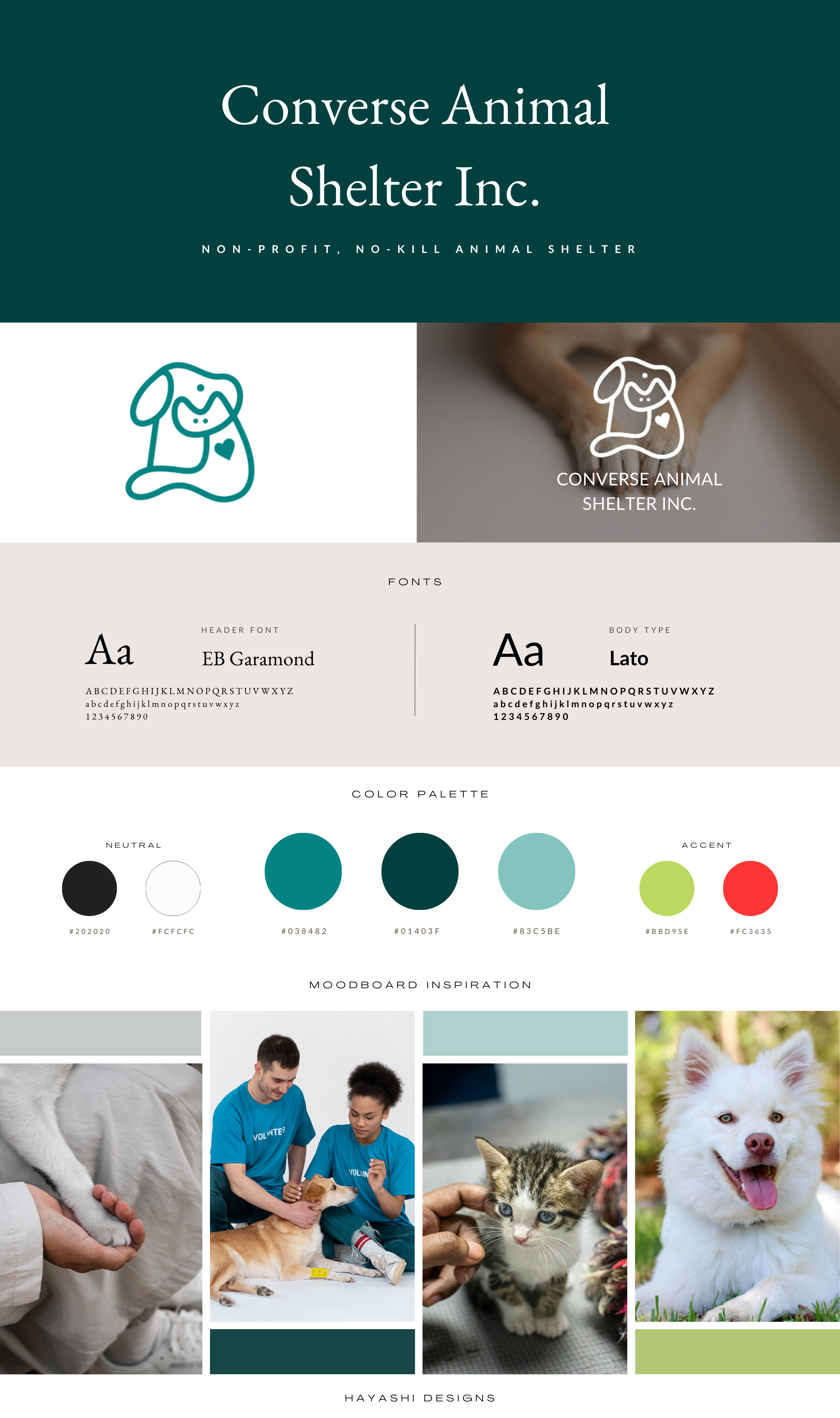
The UX designer I collaborated with created the logo.
Since the original palette had several bright colors competing with each other, we decided to darken the main teal color in order to improve contrast and prevent potential eye strain. From there we used lighter versions for logos, buttons, and backgrounds. The original colors can be used as accents, but we did not find any use cases for accent colors.
User Testing and Redesign Iterations
Round 1
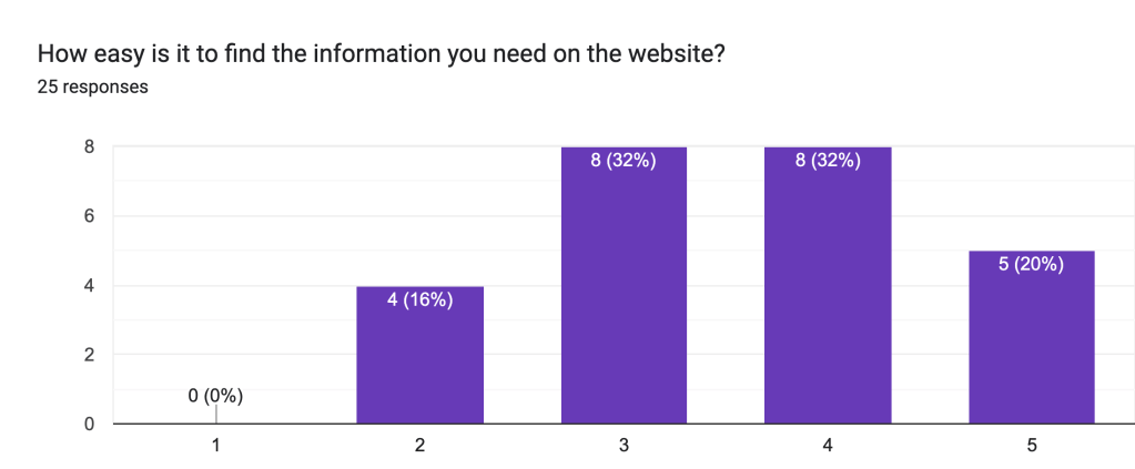
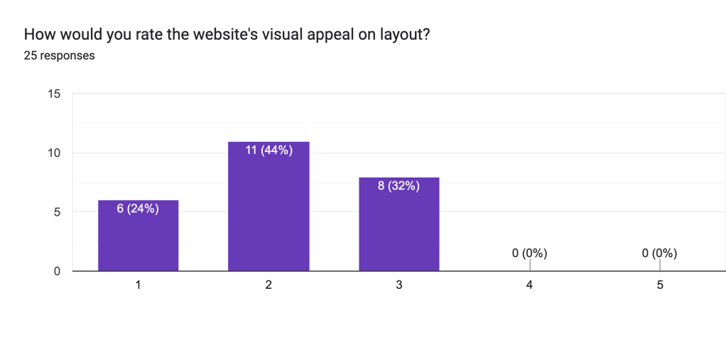
Of all respondents, 0 rated the original site a 4 or a 5 in terms of aesthetics. The information organization was decent according to users, but some aspects left questions, such as whether AdoptaPet was related to CASI, or how much it cost to adopt animals under 10 years old.
Updates
Overall, we adjusted the color palette to focus on the teal colors for a more relaxed feel, and chose two main fonts to use throughout the site.
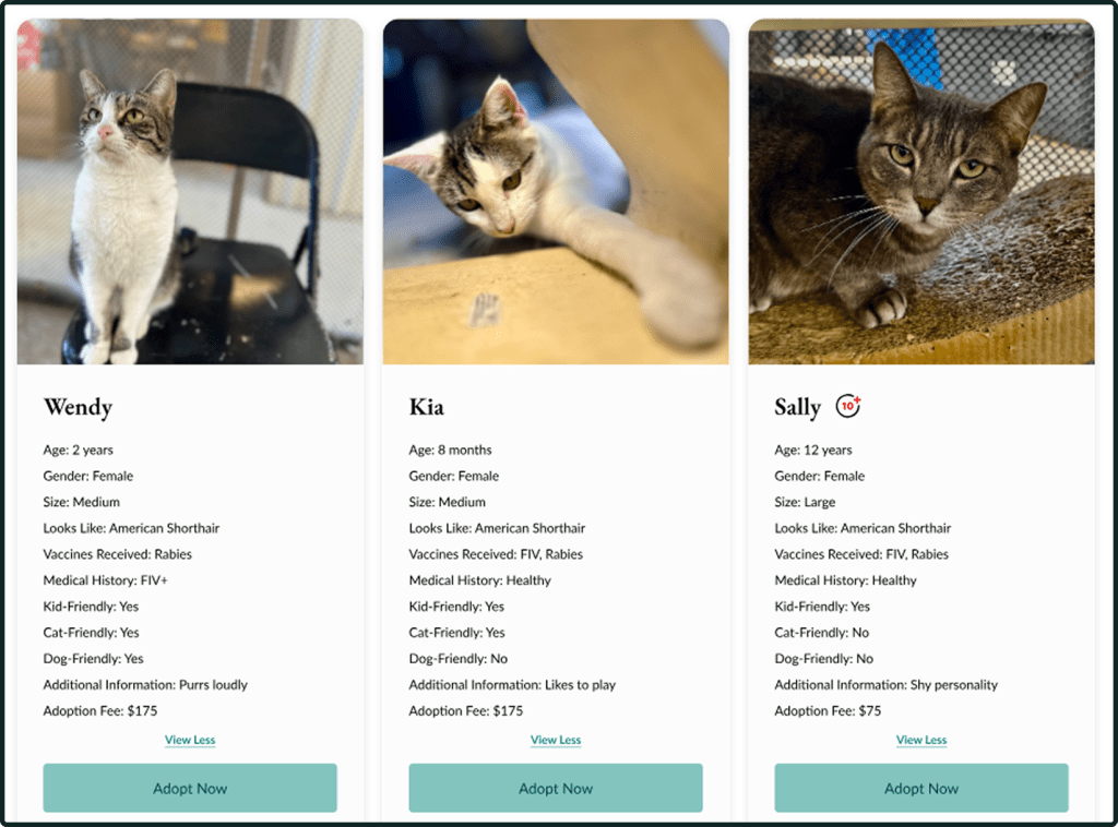
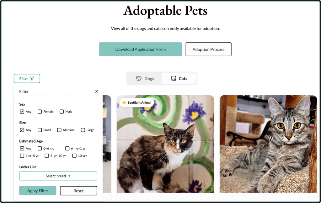
To improve the UX of the pet pages, we added uniform pet cards, allowing users to view details such as age, gender, medical history, and each pet’s adoption fee.
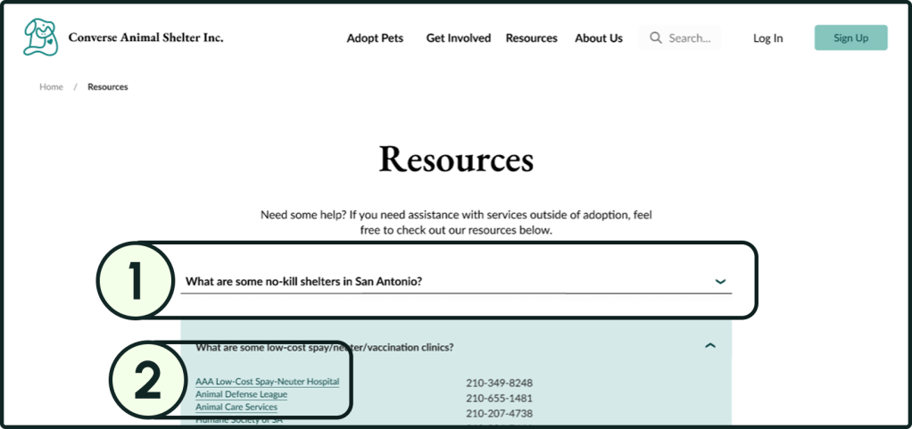
- Since users mentioned feeling overwhelmed by the information on the resources page, we made it into an accordion so that users could choose what kind of resources they wanted to investigate further.
- We also ensured each link was clearly identifiable as a link by implementing the usual combination of a distinct color and underlining.
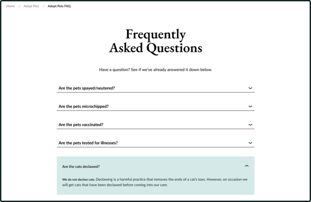
In addition, we created an FAQ page under a similar format to address the most pressing questions potential adopters could have.
Round 2
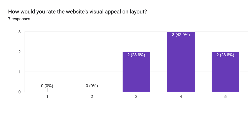
Although we had less respondents than in the previous round, the newer design was better received, with most respondents rating it a 4 or 5 in visual quality.

Updates
This round, users mainly wanted a few changes with the site navigation.
Since users wanted visual indicators of where they were on the site, we added breadcrumb trails.
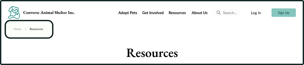
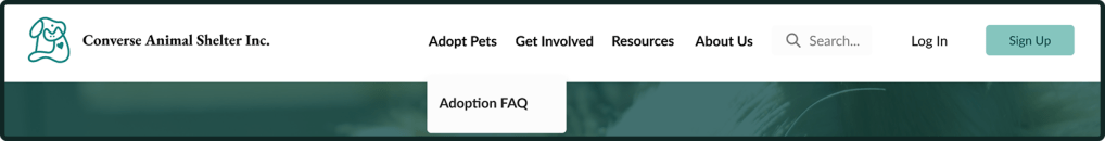
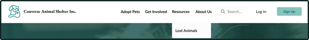
After taking some feedback regarding the page organization, we also moved the FAQ page under the “Adopt” section of the navigation bar, and the Lost Animals page under the “Resources” section.
Since breed was something users mentioned was important for choosing an animal to adopt, we created a mockup breed filter and added it to the adoption page.
Round 3
This was the best-received version. Users only wanted minor formatting changes made.
Updates
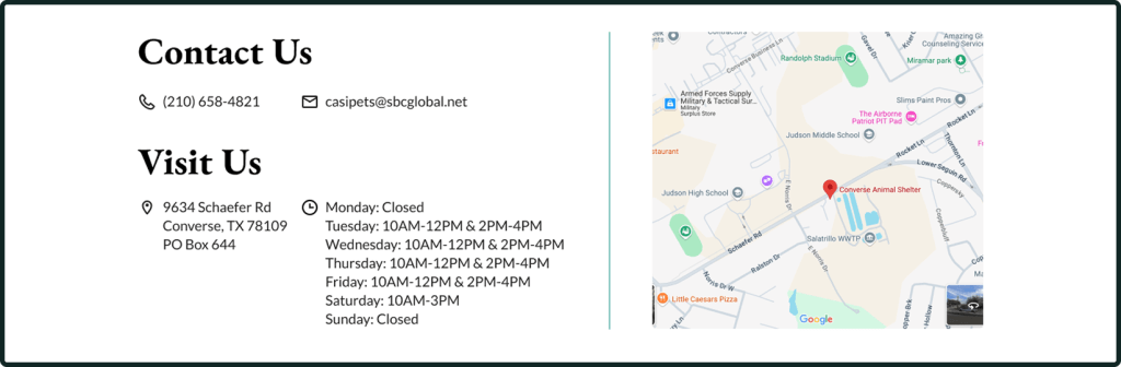
Users wanted the hours listed for each individual day, so “Tuesday-Friday: 10AM-12PM & 2PM-4PM” was split up to make readability easier.
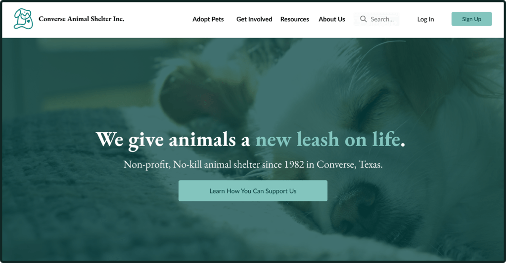
The Main CTA button on the homepage initially read “Donate”, which users found a bit too direct and off-putting. The phrasing was adjusted to adopt a warmer tone.
Reflection
What We Accomplished
- Created a redesign that
- Utilizes a more cohesive brand identity.
- Exudes professionalism to potential site users.
- Creates a user experience more closely aligned with larger pet adoption organizations.
What Was Interesting
- Working with a co-lead who specialized in user research.
- Collaborating with another UX designer and finding ways to consolidate differing visual design ideas.
- Having time to run multiple research rounds/iterations.
What Could Have Gone Better
- Organizing the new site components, logos, and other rebranding assets.
- Keeping track of the site’s design as it evolved.
What I Can Do In the Future
- Create a system for organizing site assets.
- Record the version history to better document site changes and the reasons for said changes.
