
Concept: The Paradox of Choice
You’ve likely experienced this before, or know someone who has: you’re trying to figure out where to go as a group, and nobody can seem to agree on anything. Or maybe you’re by yourself, but scrolling through countless Google search results isn’t helping you find anything you’d like.
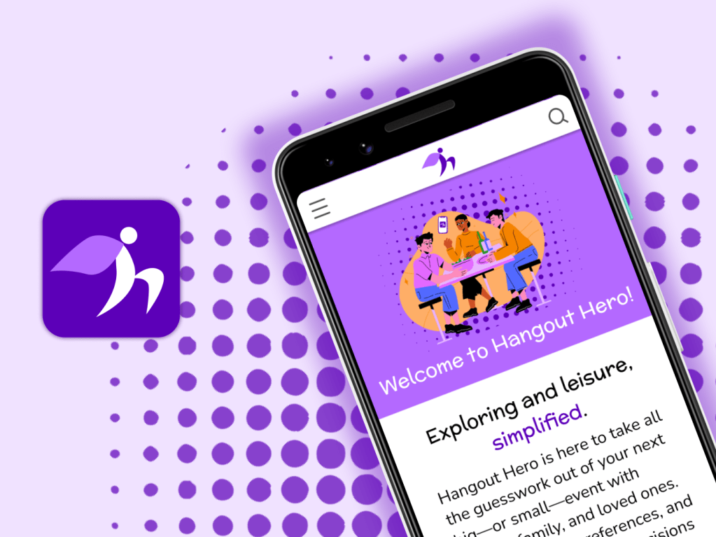
Hangout Hero aims to make the going-out experience easier by taking you and your friends’ preferences and producing a small and manageable list of choices.
Users and Audience
Our team needed to conduct user testing with an audience we could easily access. We focused on the Denton, Texas area for insight on the perceived availability of restaurant and entertainment venues. Being college students, we primarily focused on users aged 18-24. Our secondary audience was indecisive people, given they would be more inclined to use our app.
Objectives
Identify an accessible demographic and address an issue they have.
Develop an app concept that addresses the demographic’s issue.
Gauging Interest via Survey
First, we needed to determine if there was any interest or need for our idea. To do this, we shared a survey among our peers to determine whether the paradox of choice actually existed in this context. Overall, the results supported our initial hypotheses.
When asked if new to the Denton area, 52% respondents answered no, but a majority of responses received an answer from three to five for agreement with the following statements:

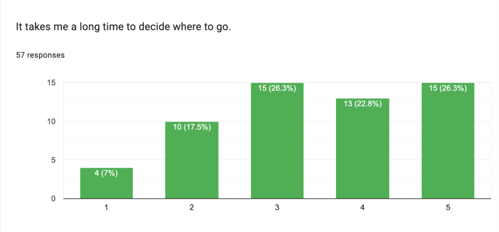
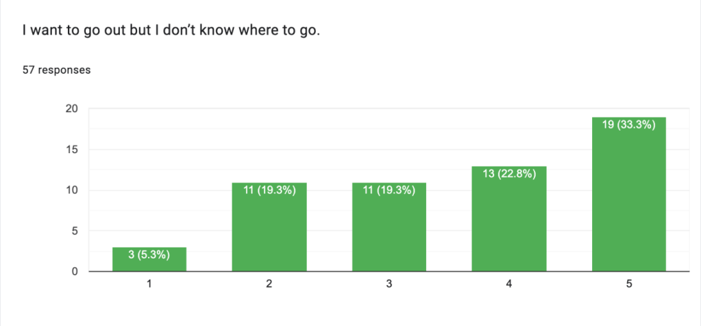
From that, we realized that the time spent in Denton was not the crux of the issue so much as general unfamiliarity with what the area had to offer.
Investigating Our Audience’s Process
With our need confirmed, we interviewed prospective users from the target demographics. We asked users to walk us through their process for planning outings with their friend groups. In order to plan our features, we needed to look into factors users considered when making plans.
“The first thing I would do is like consider how we were going to get there. I said I don’t have a car, so I would have to negotiate. Who’s willing to drive if we wanna split the payment for gas? If we’re going, like, somewhere real far away?
“And then I guess the next thing I’d consider is like budget. Are we gonna be planning on, like spending money?
Is there, like an entrance fee or is it just gonna be like we’re gonna go to the mall and hang out?”
— Lauren
We also wanted to consider what users considered to be an easy amount of options to choose between. Both of my interviewees mentioned that having at least three options to choose between was easiest.
Next, we asked questions that probed behind what makes the decision-making process so difficult. One user notably mentioned the following:
“We all like food, however, two of the people I’ve mentioned have dietary restrictions and food sensitivities.
“I’m not able to like easily compare and contrast [my options] on Google Maps.”
— Valerie
With this, we knew that we needed to include ways to
- filter based on distance.
- filter based on price.
- allow users to plan to visit multiple places.
- account for dietary preferences and restrictions.
- quickly compare venues.
Initial Design
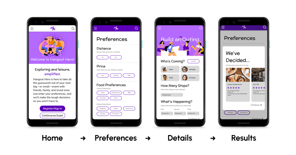
Home: With our home page, we wanted to incorporate a feature where returning users could have their preferences saved, along with a guest version for less frequent users.
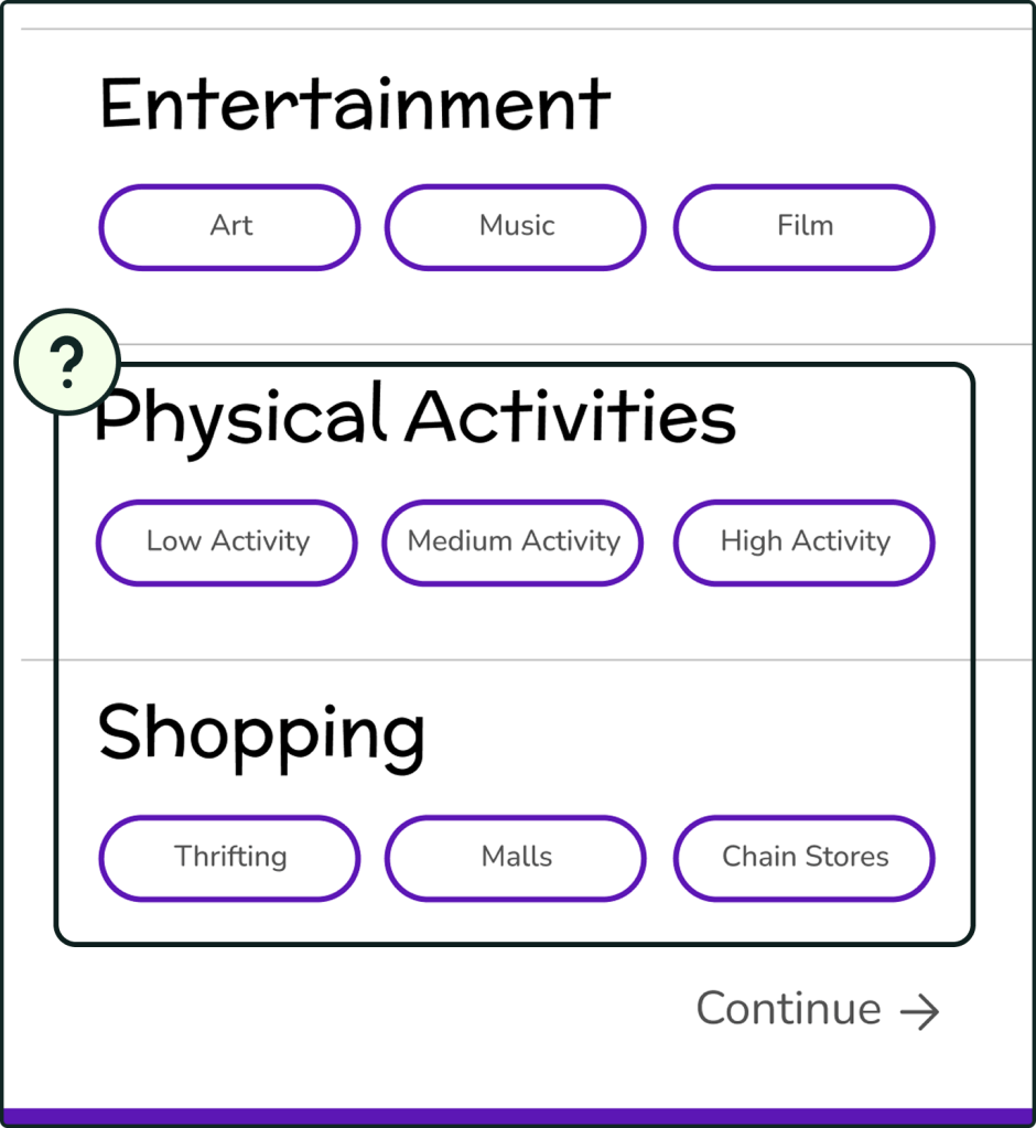
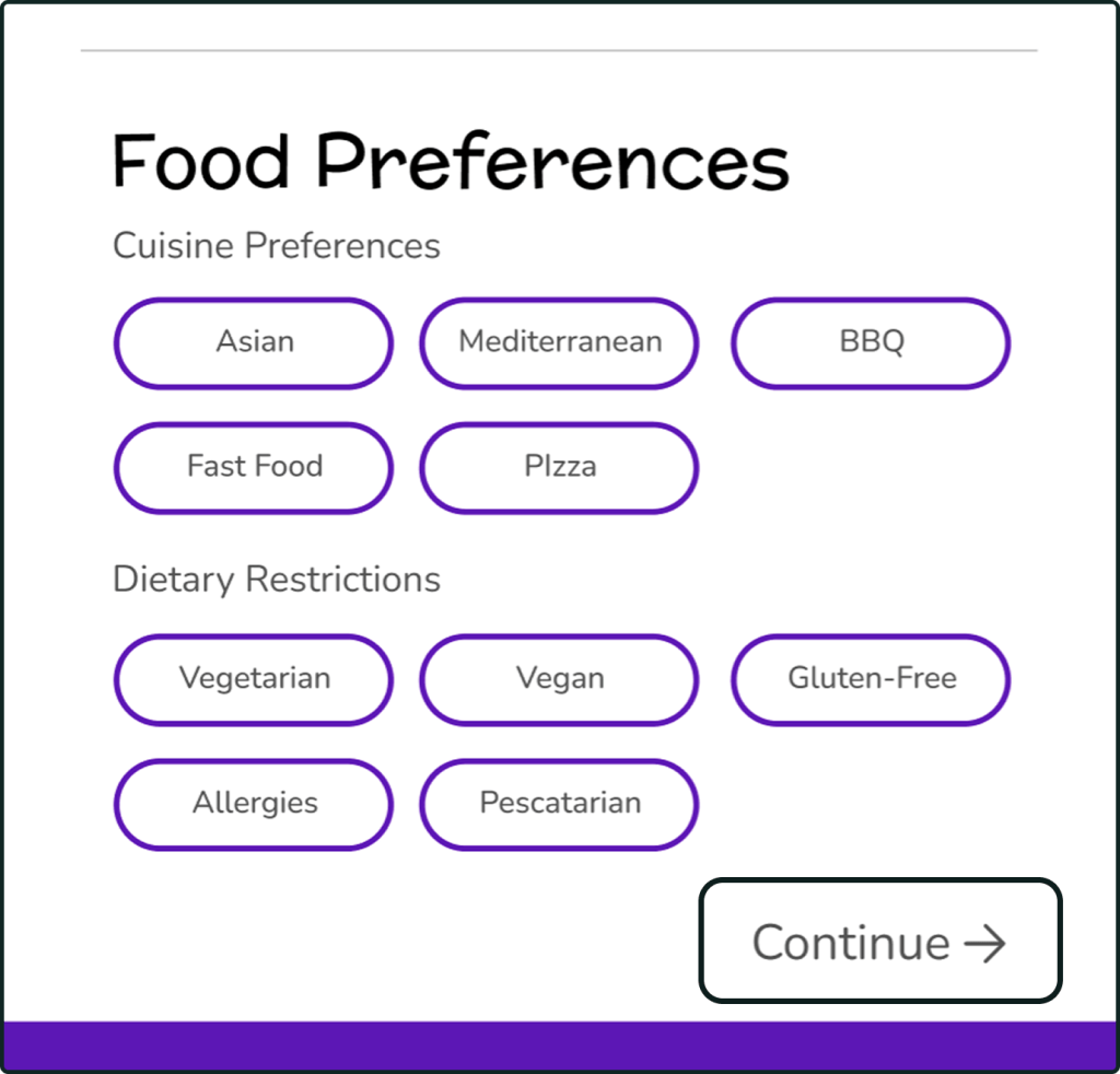
Preferences: The intake menu allows users to select preferences relating to distance, price, dietary restrictions, and more.
With an account, this information is saved for subsequent use after the user enters the information the first time.
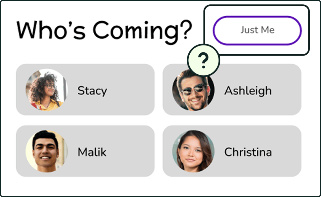
Details: Taking into account that our users mentioned going to multiple places during an outing, we wanted to have a way to determine the number of places and which order they’d be visited in. Choosing the solo option informs the app to input only the user’s preferences; selecting friends prompts the app to consolidate a group’s preferences to find the choices that appeal to the most members.
Results: A pop-up allows the user to quickly compare and contrast from three generated choices per venue.
User Testing Results
We conducted some brief user tests with some passerby students, with the scenario that they were going solo and trying to choose a place to eat. Due to Figma limitations regarding conditionals, the scenario couldn’t be more in depth.
The testers tended to overlook this part. In retrospect, we should have planned a scenario that involved inviting at least one friend.
Because our scenario only involved going to one stop, users were confused about needing to enter preferences for other genres of outings. As a result, the process, which we intended to take around 15-30 seconds, ended up taking a bit longer.
Addressing Areas of Improvement
We decided to redesign the preferences menu to only implement choices relevant to what the user was seeking. For example, when looking for a restaurant, the user would no longer need to add preferences about other outing types.
What we believe ultimately caused the most confusion was not making the destination(s) clear before asking a user for preferences on said location(s). Our initial user flow focused on logging preferences first without considering the number of group members or the desired locations. We adjusted the user flow to have our Details page come before Preferences instead. This way, the users could decide the destination(s) first, and then choose preferences relevant to their objectives for the outing.
We did not have time to implement a second round of changes, but incorporating a scenario with the account and friends function would have better informed the design of the “alone vs. group” section of the outing planning.
We also attempted to prototype in Axure RP 10 to add conditionals such as number of stops and stop types. While the prototype was not completed within the timeframe, my work in Axure served as a good learning experience that familiarized me with the software.
Reflection
What We Accomplished
- Created an app concept that allows users to
- Save time deciding on places to go.
- Get recommendations that match their tastes.
- Discover new places.
- Become more familiar with the Denton area.
What Was Interesting
- Choosing our own issue to solve.
- Working in a small team with undivided attention from the professor for guidance.
- Learning conditional logic in Axure RP 10.
What Could Have Gone Better
- Defining a realistic scope for the project.
- Scheduling multiple user testing rounds.
- Allocating time to the development process.
What I Can Do In the Future
- Define the project scope via prioritization exercises.
- Conduct user surveys to determine what app functions the audience deems most important.
- Allocate time to learning new software.
- Develop and strengthen my coding skills.
