Background
The client, LTC Aerospace is a company located in Sparks, Nevada. LTC Aerospace is an aerospace parts manufacturer who sells parts to military aircraft manufacturers, rocket engineers, hospitals in need of medical devices, and companies that produce green energy. The client requested an improved website, with creative liberty being up to the designers.
Building the Future Through Aerospace
It can be difficult working in aerospace. As mentioned above, the clients work in high-stakes industries. Whether it’s building planes and rockets or coming up with environmentally friendly energy production methods, the clients can rely on LTC Aerospace to serve as a middleman and get them the parts that they need. With that in mind, our team sought to streamline this large scale shopping experience to help all parties involved.
Objectives
Establish the client’s brand identity with a style guide.
Edit and reorganize the site content.
Create mockups using brand identity and revised content.
Examining the Original UI/UX
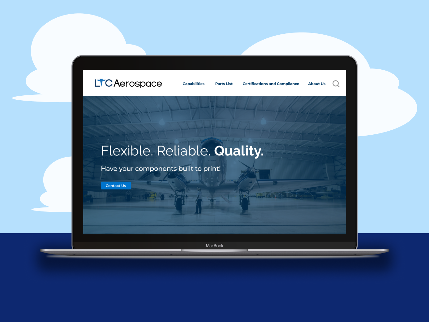
When looking at this site’s hero section, the hero lacks information on what part LTC plays in the aerospace industry, indicators that there is more content on the page, and a cohesive, seamless design.
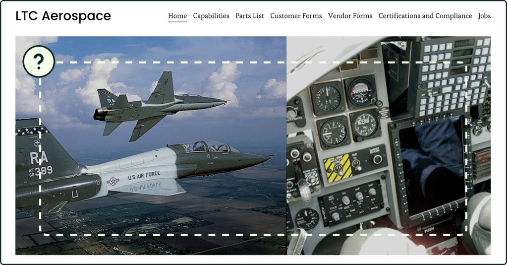
Many of the site’s pages contained this unbalanced layout where the text is solely on the left, leaving an excess of white space on the right.
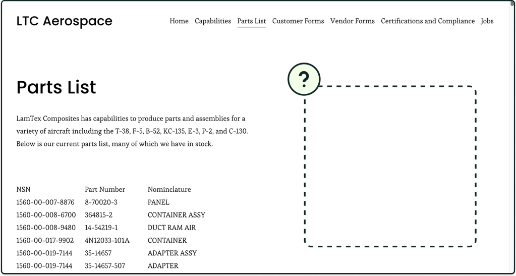
The company’s main purpose is to sell aerospace parts. However:
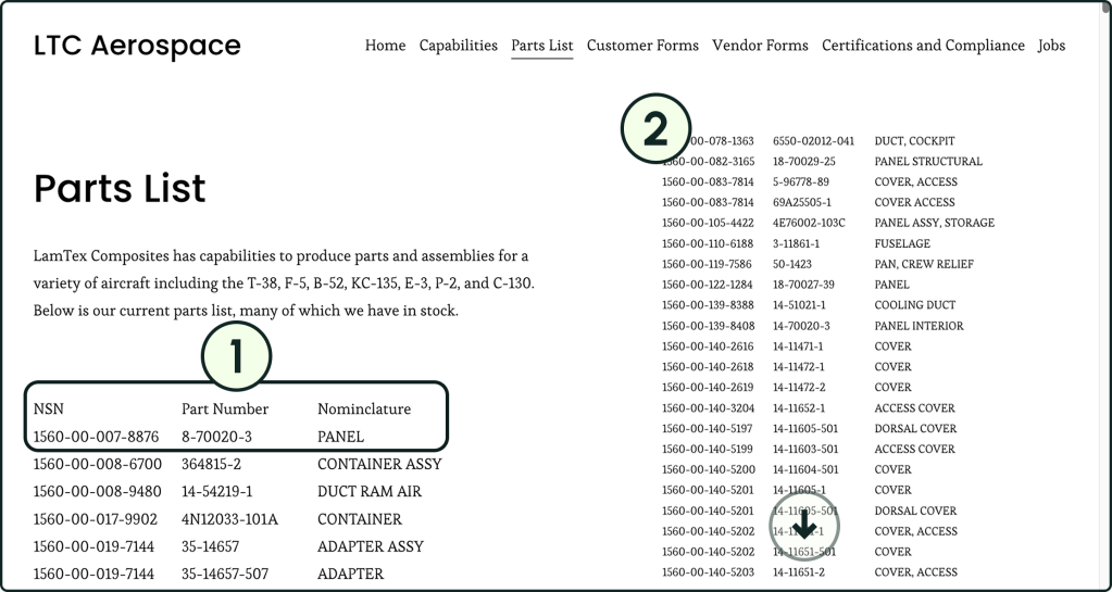
- This parts list has no organization aside from listing the national stock numbers (NSN) in numerical order.
- Users need to scroll through the list to find the part(s) they need, and the list goes on for quite a while.
Building the Brand Identity
To create the brand logo, we decided to incorporate planes into the logo, with a military jet taking the place of the T in LTC.
For the color palette, we chose blue because it represents loyalty and confidence, two qualities we wanted to convey to prospective buyers, and gray for balance between the deep blues and the white background.
For the fonts, we chose Montserrat as the body copy for an open, easy to read font. We chose Raleway for the headings because it fits a corporate aesthetic.

The Redesign
UI Design Changes
Throughout the website, I made sure to:
- add hero spaces that defined the page and explained its purpose.
- include more visualizations to break up the text and illustrate concepts in a visually compelling way.
- expand the text to fill a container to avoid unnecessary white space.

Functional Changes
With input from the content sub-team, I:
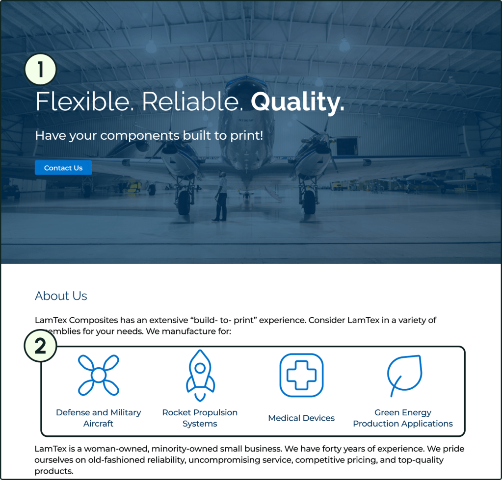
- added a tagline, a quick summation of the company, and a call-to-action button to the hero space. This way, users can more quickly get a sense of LTC Aerospace’s mission.
- used iconography to illustrate the company’s main clients. By drawing the viewer’s eye, a user can quickly get the sense of this company’s audience.
In order to improve the usability of the parts page, we:
- turned the part types into tags that a user can apply as a search filter, allowing users to search by part type.
- added a search bar to the page’s hero space to enable users to search by part number.
- converted each part into a card format for easier reading.
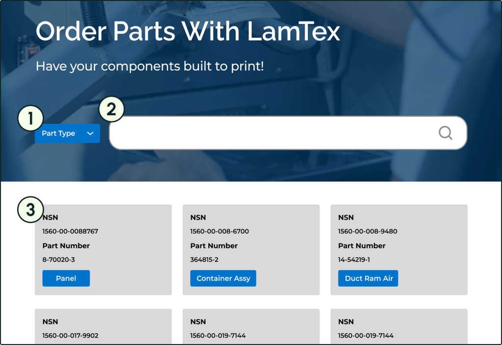
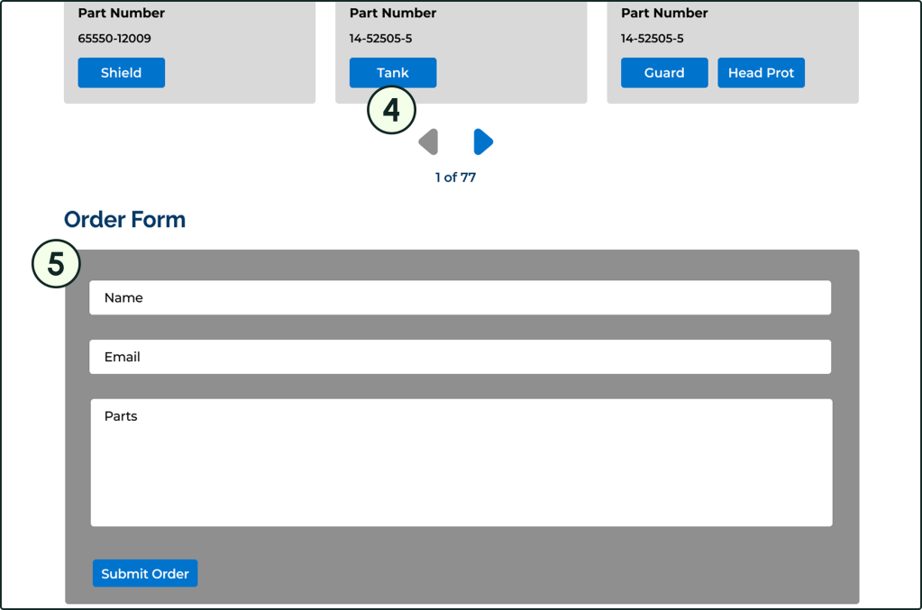
- compressed the parts list into a carousel that users can browse through to reduce the need for scrolling.
- included a short form to fill at the bottom of the page so users can quickly let the company know which parts they’re interested in ordering.
Reflection
What We Accomplished
- Created a redesign that
- Communicates each page’s purpose more clearly.
- Offers multiple navigation methods for the machine parts list.
- Solidifies the client’s brand identity.
What Was Interesting
- Working with a client who would genuinely consider our products for the final site design.
- Collaborating in several sub-teams for the first time.
- Leading my own sub-team.
What Could Have Gone Better
- Getting the copy from the editing sub-team more smoothly.
- Sending assets to the development sub-team efficiently.
What I Can Do In the Future
- Be more involved in the wireframing process.
- Change tag colors so they don’t read as buttons.
- Add interactions to create a working prototype.
- Look into UI design trends to create less repetitive hero spaces.
