UX Case Study: Voertman’s Bookstore
Our team worked with a local client to evaluate and improve their website’s design. We conducted background research into the major user demographics and performed a card sort, a heuristic evaluation, and a think-aloud protocol. We consolidated the results of these tests into a mobile-layout prototype of the site. The client was pleased with our feedback and applied as much as they could to the site.
Tools
Adobe XD
User Testing Optimal Sort
Team
Andrew
Taylor
Brianna
MY role
Prototypist
Date Completed
May 2022
Users and Audience
Voertman’s is a college textbook and art supply shop that services the students of the University of North Texas and Texas Women’s University.
We interviewed the store owner for demographic info, who informed us his largest age demographic was 18-24. He also noted that his clients were more likely to access his site on their phones. With this in mind, our team decided to create a prototype with a mobile layout.
A Crash Course in All Things Art Supplies
While Voertman’s specializes in textbooks, half of the store is dedicated to offering a wide array of art supplies to art students. The store makes custom kits to cover the bases for beginners, but sometimes art professors want their students to use less common media. When I was a student, I recall looking through the syllabus’ lengthy shopping list and asking myself, “What the hell is india ink?” And I wasn’t alone.
Our team’s goal was to make this awkward transition a little less awkward for art students. We wanted to simplify buying textbooks and merchandise as well.
Objectives
Conduct three user tests with the client’s target audience.
Create a prototype that incorporates user testing data into a user-friendly mobile layout.
Examining the Original UI
Our team took a cursory look at the website to see if we could spot any prominent areas needing improvement. We found the following:

User Testing
Card Sort
In order to consolidate the numerous items in the navigation bar, we conducted an open card sort with five testers. They agreed on the following major categories overall: About Us, Art Supplies, Clothing and Apparel, Decor, and Textbooks.
Heuristic Evaluation
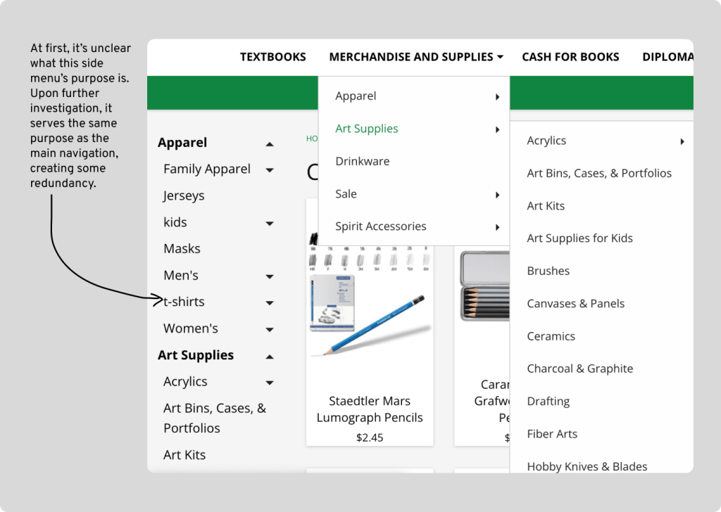
We used Nielsen’s set of heuristics to evaluate this site. The evaluation solidified our initial findings. The site did well overall, with the only issues coming from Heuristic #8: Aesthetic and minimalist design. Minimalist design entails keeping content concise. The navigation menu took up a lot of space on the homepage when opened, at times requiring the user to scroll down to see all the list items. In addition, some of the list items appear multiple times.
Think-Aloud Protocol
For the think-aloud protocol, we had three users attempt to complete three tasks throughout the site:
- Locate the “Watercolor Mediums” category.
- Navigate to the “Order Status and Tracking” page.
- Locate the “Plush and Toys” category.
We chose those the tasks in particular to look into the sub-audiences of students needing textbooks and art supplies respectively. We included the “plush and toys” category to see if users could accomplish tasks that did not relate to the aforementioned audiences.
In all three tests, users were initially daunted by the overwhelming amount of items in the navigation. On average, it took users 12 minutes and 14 seconds to complete the three tasks. In a typical scenario, a user would have gotten frustrated and given up. Nonetheless, they all rated the ease of the tasks around 3 out of 5, with 5 being the most difficult. From this we gathered that the tasks would have been easier to complete if not for the navigation’s layout.
The only other comment relating to UI design was about the side navigation, which the user mentioned was confusing.
With this in mind, I aimed to complete a prototype addressing the navigation design.
The Redesign
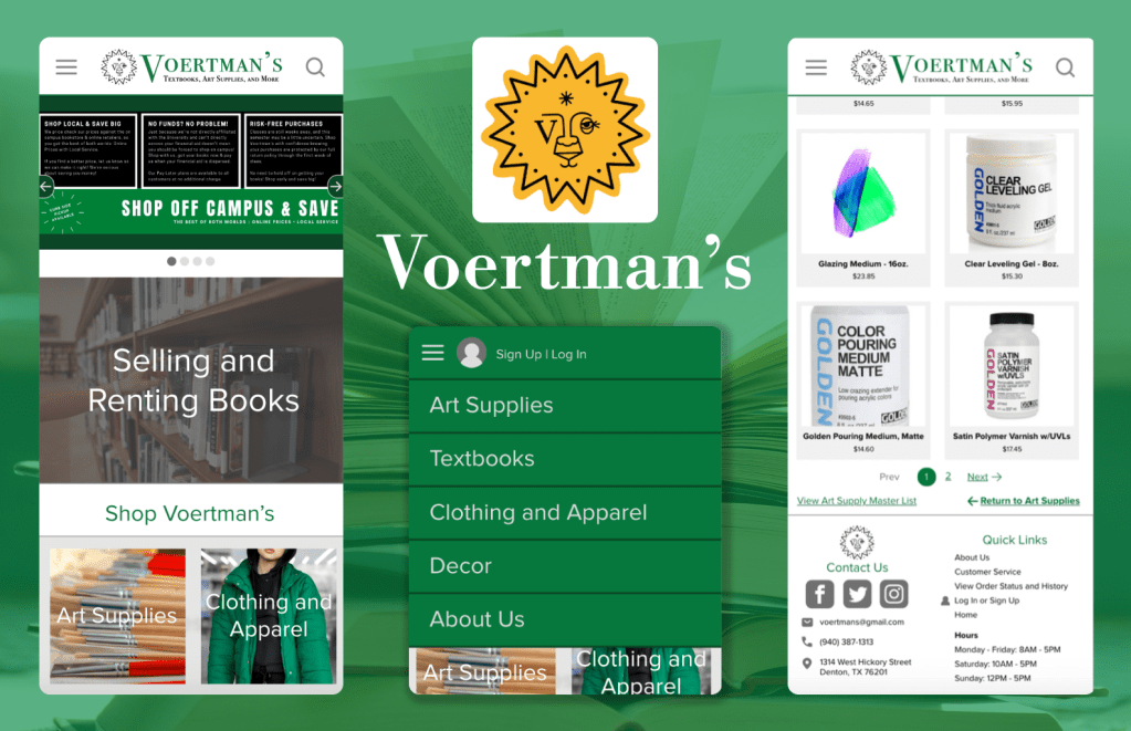
The first redesign I incorporated was a logo change. I made the description text more concise and increased the text size to increase its readability.
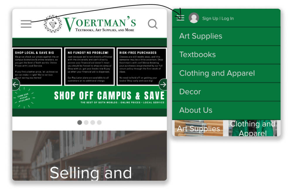
Next, I collapsed the navigation bar into a hamburger menu using the agreed-upon categories from the card sort. This frees up space onscreen for hero space and pertinent info.
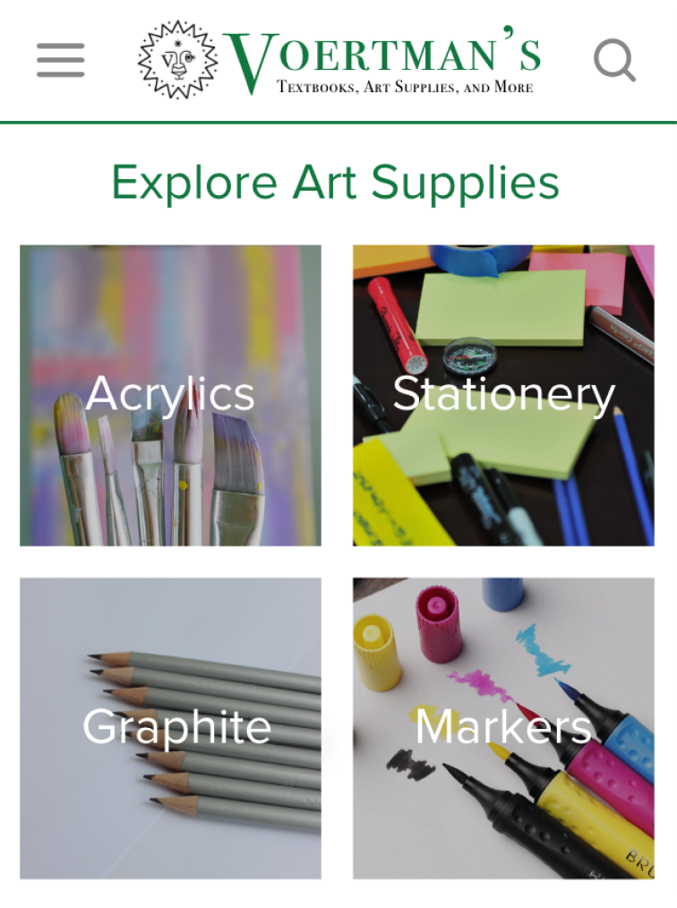
Then, I created pages for each first-level item to display their respective second-level items. I also attached the links to the item listing pages to image tiles. This way, the site could display their items, and users wouldn’t need to look at small text grouped together in a drop down.
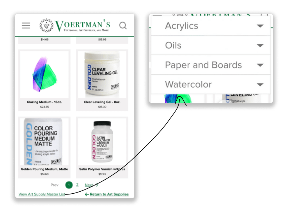
Finally, I omitted the side menu and devoted a floating menu for the categories with the lowest-levels in the hierarchy. This way I could prevent users from navigating a menu that covered their entire screen. I also made sure to include a call-to-action that specifies what this menu is for.
Full Prototype
Below is a short walkthrough of the site’s improved navigation.
Reflection
What We Achieved
- Created a redesign that
- Eliminates navigation redundancy.
- Communicates the site’s brand and purpose better.
- Received compensation for our site feedback.
What Was Interesting
- Learning about prototyping in Adobe XD.
- Discovering how convenient it is to have recorded feedback from users via Think-Aloud protocols.
What Could Have Been Done Better
- Redesigning items such as the home page’s carousel in a mobile-friendly format as well.
- Consolidating repeat list items for gender and sizes by adding filters on the clothing pages.
- Conducting the think-aloud protocol in a mobile format.
- Adding drop downs in the hamburger menu instead of adding a page for the second level of hierarchy.
What Can Be Done In the Future
- Experimenting with drop-down interactions for collapsed menus in my prototypes.
- Experimenting with filters; sorting clothes by age group and gender would have allowed this client to remove those categories from their navigation.
- Conducting user testing with mobile layouts to see where users are struggling on a mobile version of a site.
- Conducting A/B Testing to determine which navigation layout users prefer.
 Hayashi Designs